A NEW CREATIVE MARK
A visual system that inspires connection
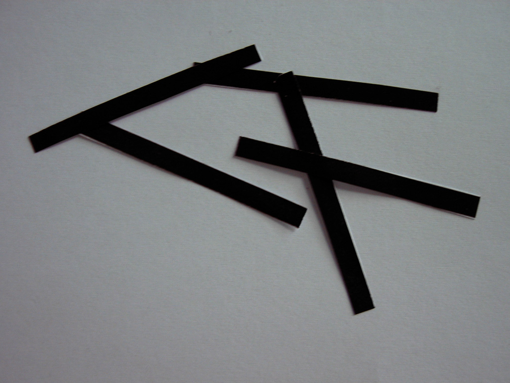
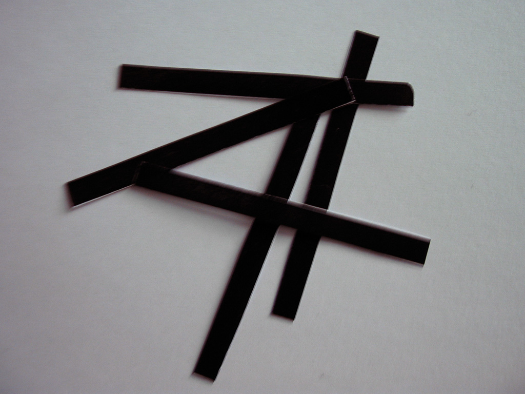
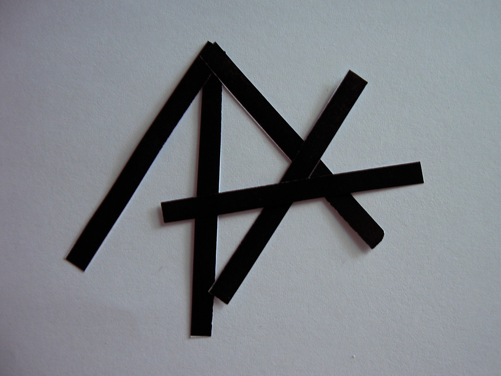
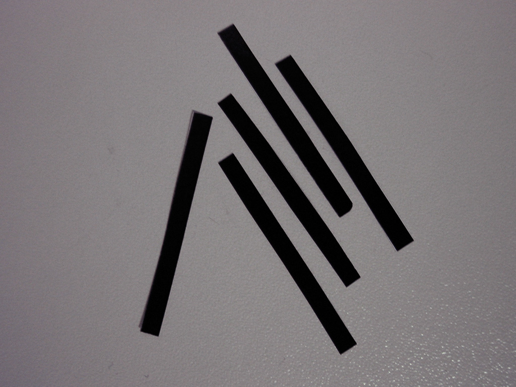
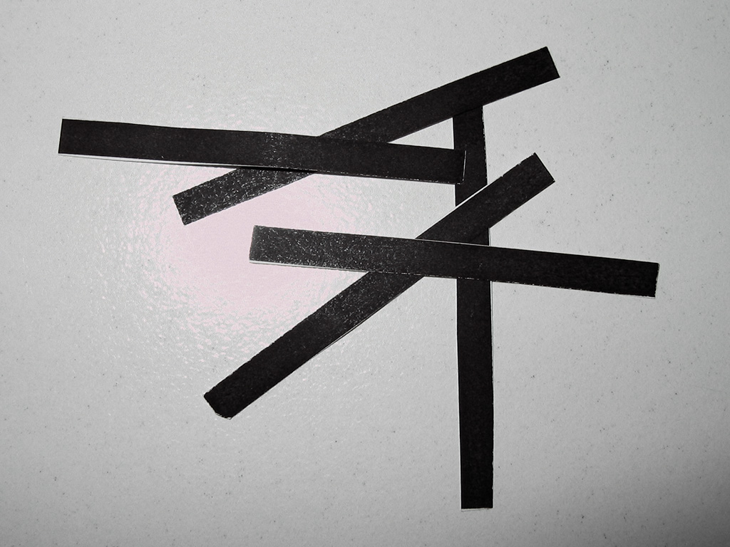
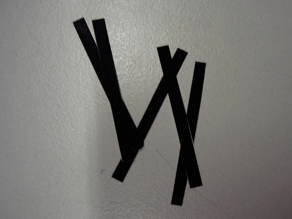
The new identity distinguished itself through clarity and uniqueness. The logo variations became a shared expression within the community, celebrated for their adaptability and strong visual character.
BACKGROUND
Pforzheim University had an established logo at the institutional level, but the Faculty of Design was missing a visual identity that reflected its creative DNA. As one of the leading design schools in Germany, the faculty needed a brand system that visually expresses experimentation, diversity, and design thinking, while still maintaining visual ties to the university brand.
This project was initiated as part of a semester-long design competition. My concept was selected as the winning proposal, which led to me being commissioned to implement the identity system and design a printed faculty magazine that was distributed during the annual exhibition called Werkschau.
This is what the general logo of Pforzheim University looks like.
GOAL
The objective was to create a bold and forward thinking logo and visual language for the Faculty of Design that would reflect its creative spirit and the wide range of disciplines it represents. The identity needed to feel modern, fresh, and visually dynamic, while structurally aligning with the university’s main logo and maintaining a distinct presence of its own.
It was essential that the system work seamlessly across print, digital, and motion platforms, and that it be flexible enough to adapt to each program within the faculty while preserving overall brand consistency. In addition to the logo, the visual identity was to be extended into an editorial format that showcased all degree programs in a cohesive and compelling way.
SOLUTION
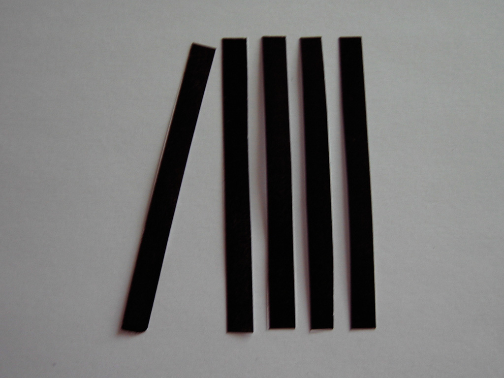
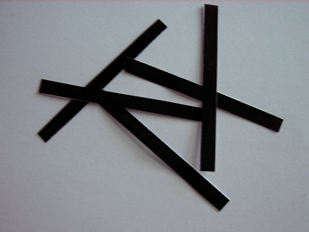
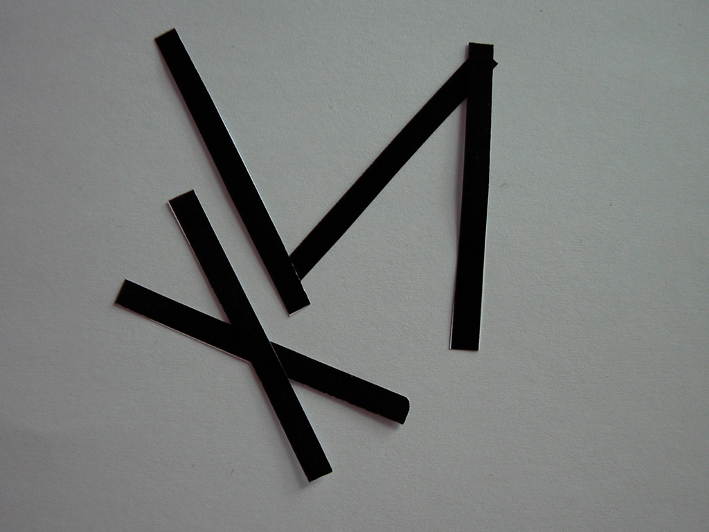
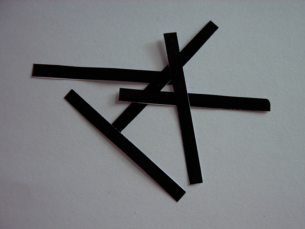
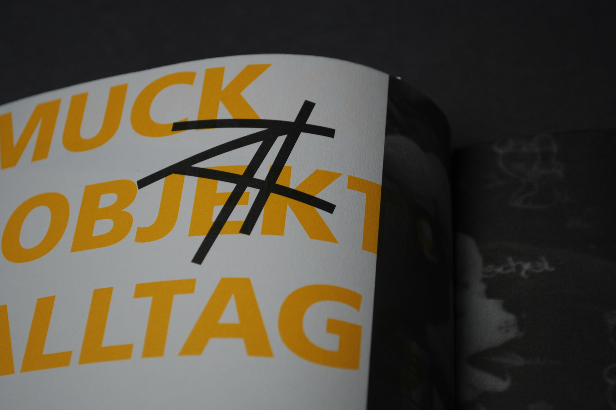
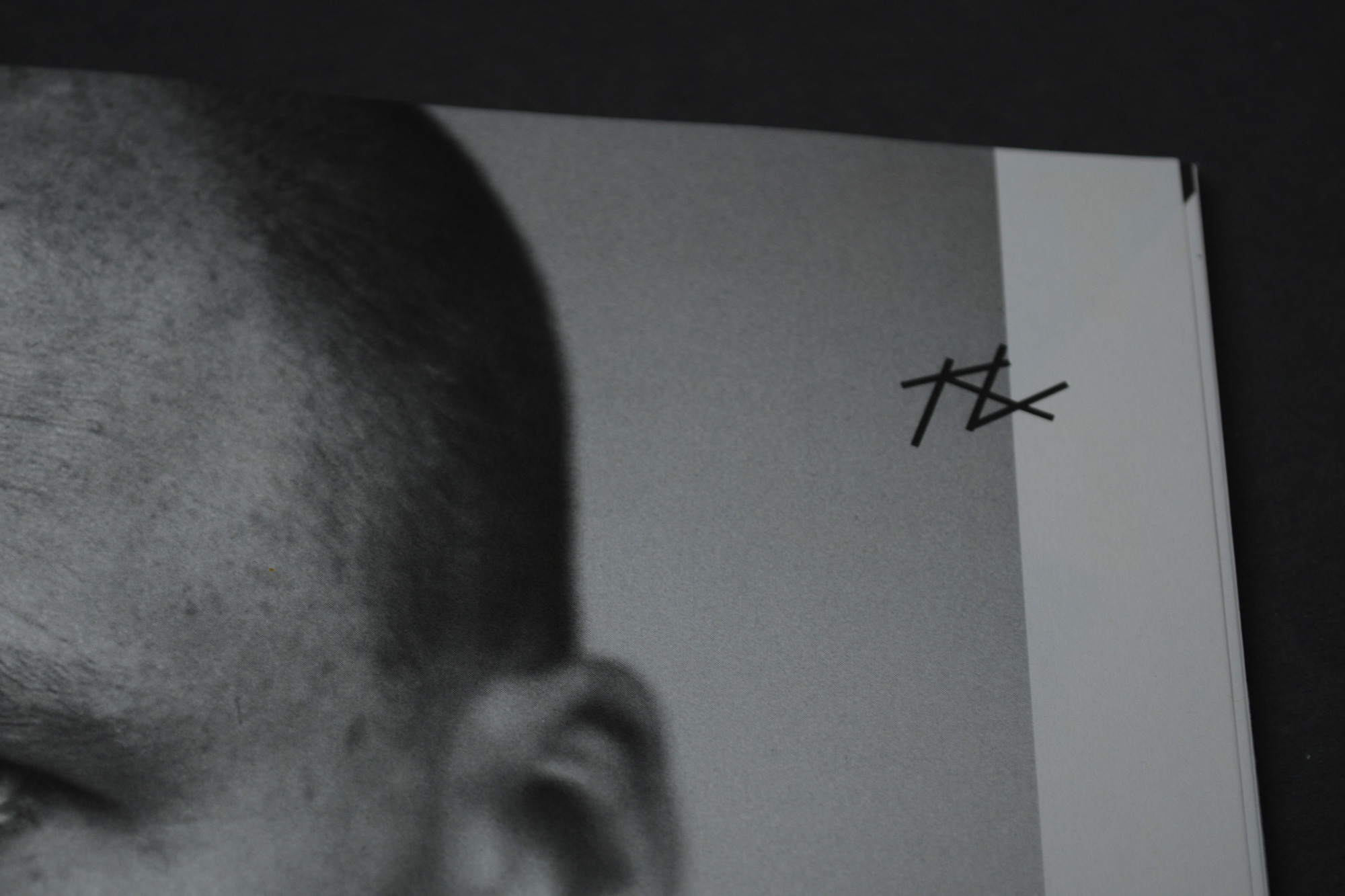
My approach began with a detailed exploration of the university’s existing logo. I broke it down into its core visual components and rebuilt it into a modular, evolving structure that supports endless visual reinterpretations. The outcome was a flexible and responsive logo that reflects the dynamic and creative nature of the faculty, while staying rooted in the university’s identity.
A key aspect of the project was its ability to live in motion. As early as 2008, I designed an animated version of the logo that introduced movement and transformation into the identity. At that time, animated branding was not yet common in academic environments, making this a forward looking and innovative contribution.
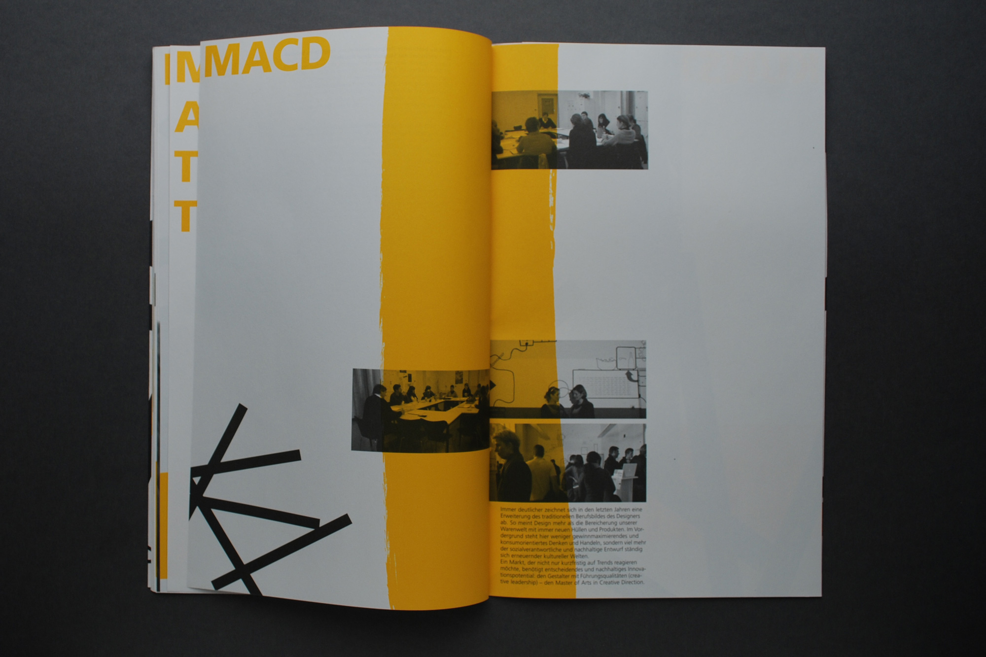
Magazin
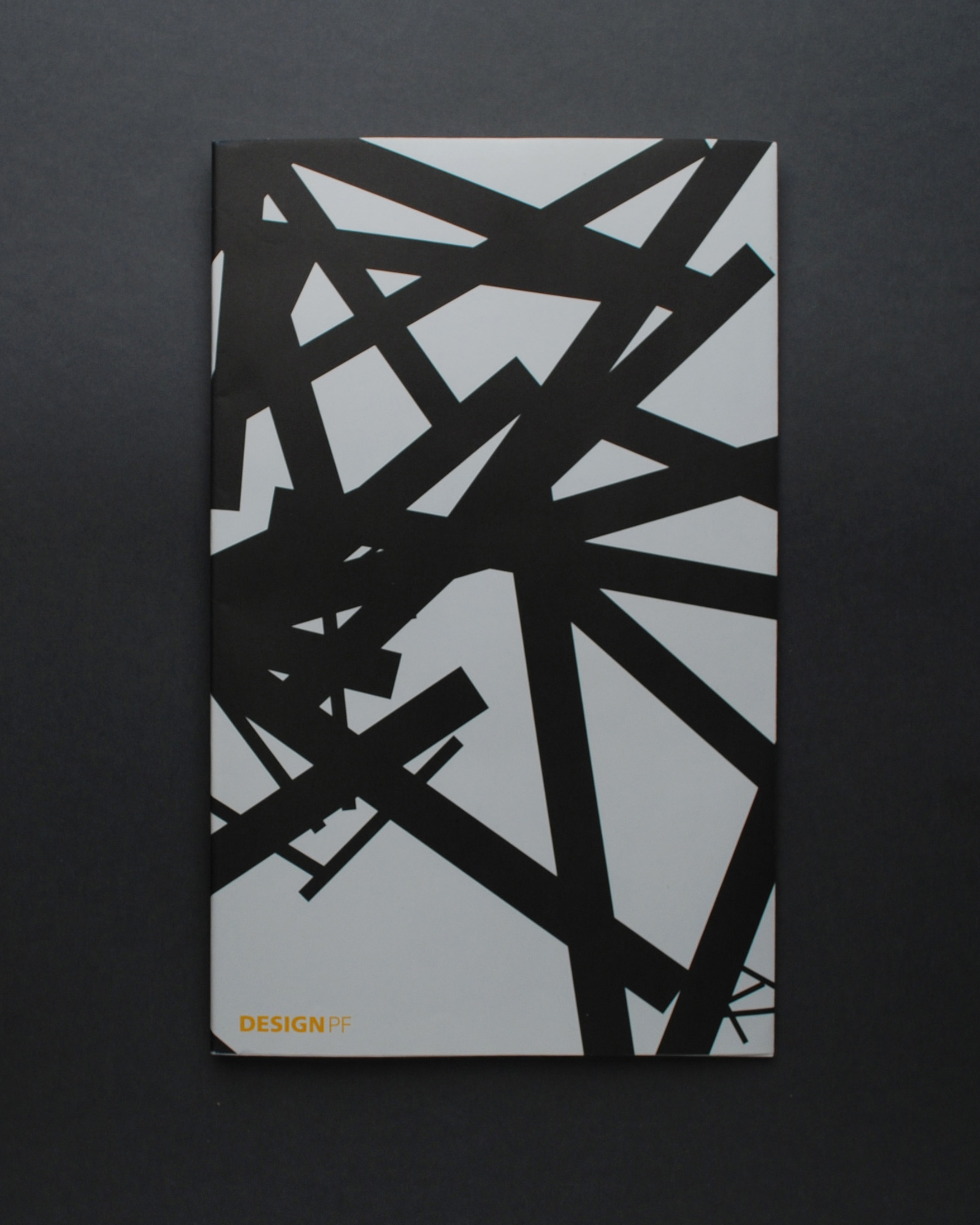
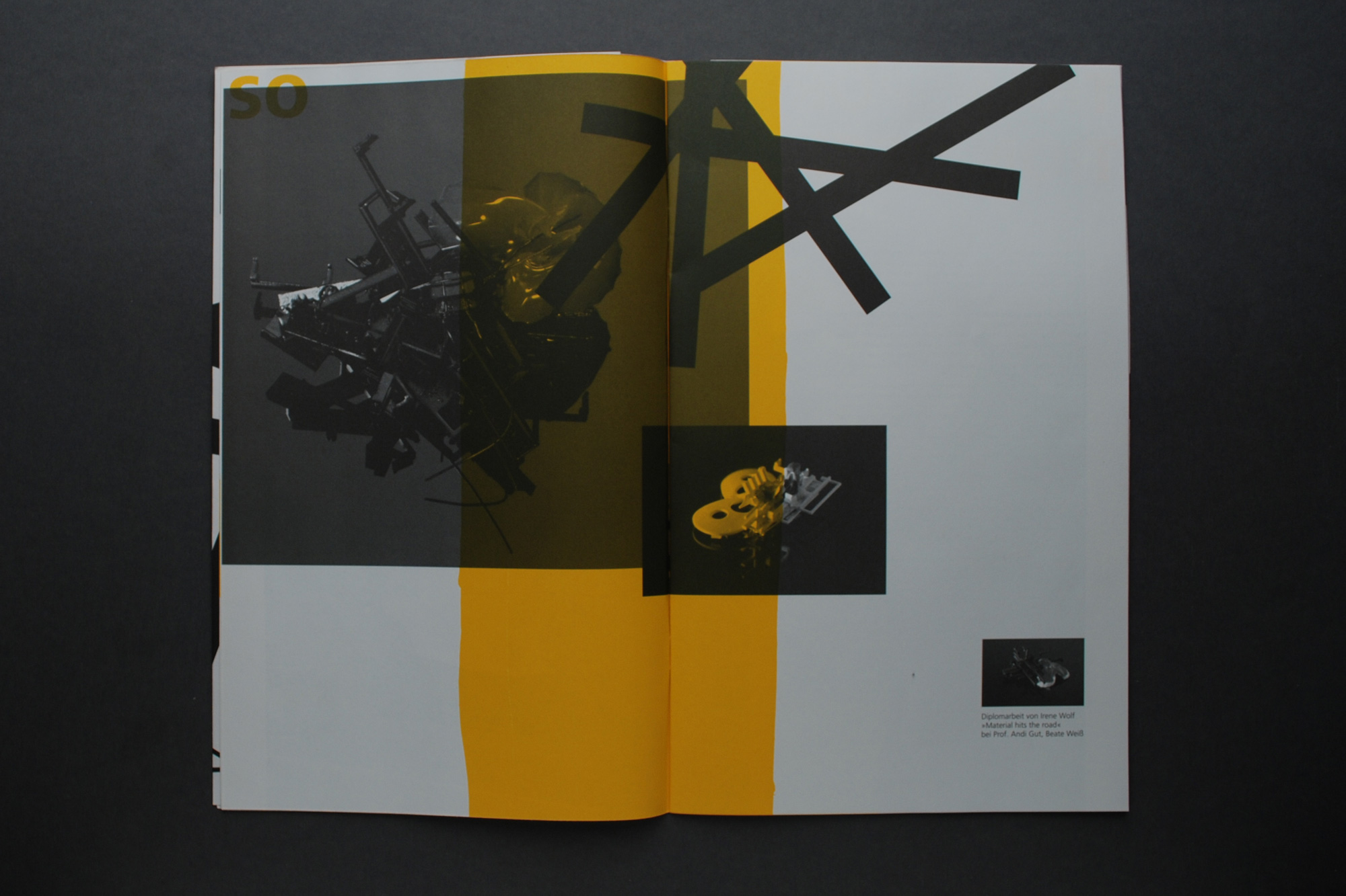
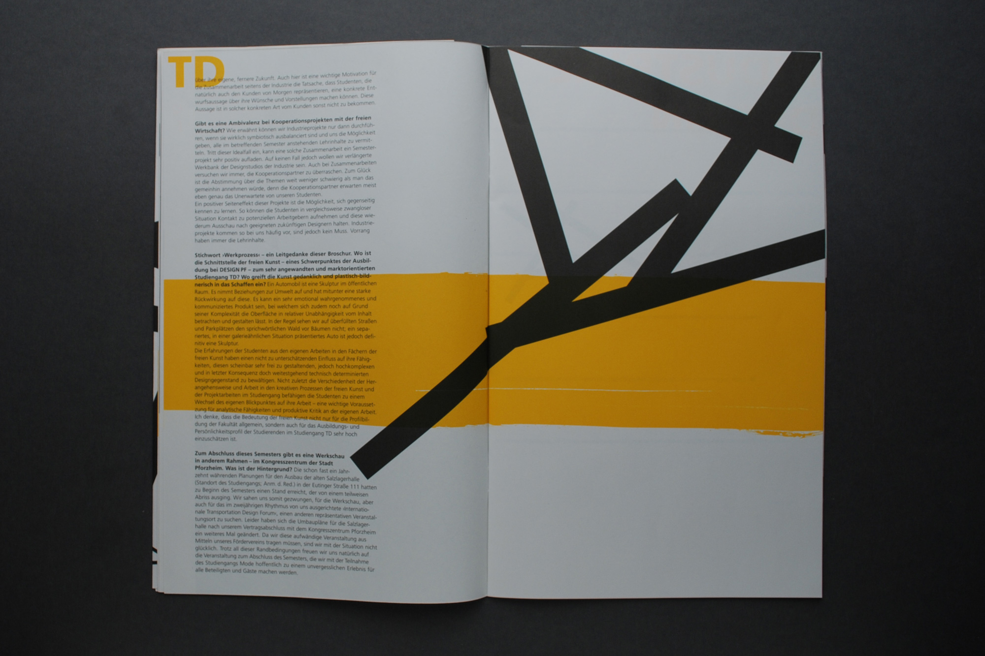
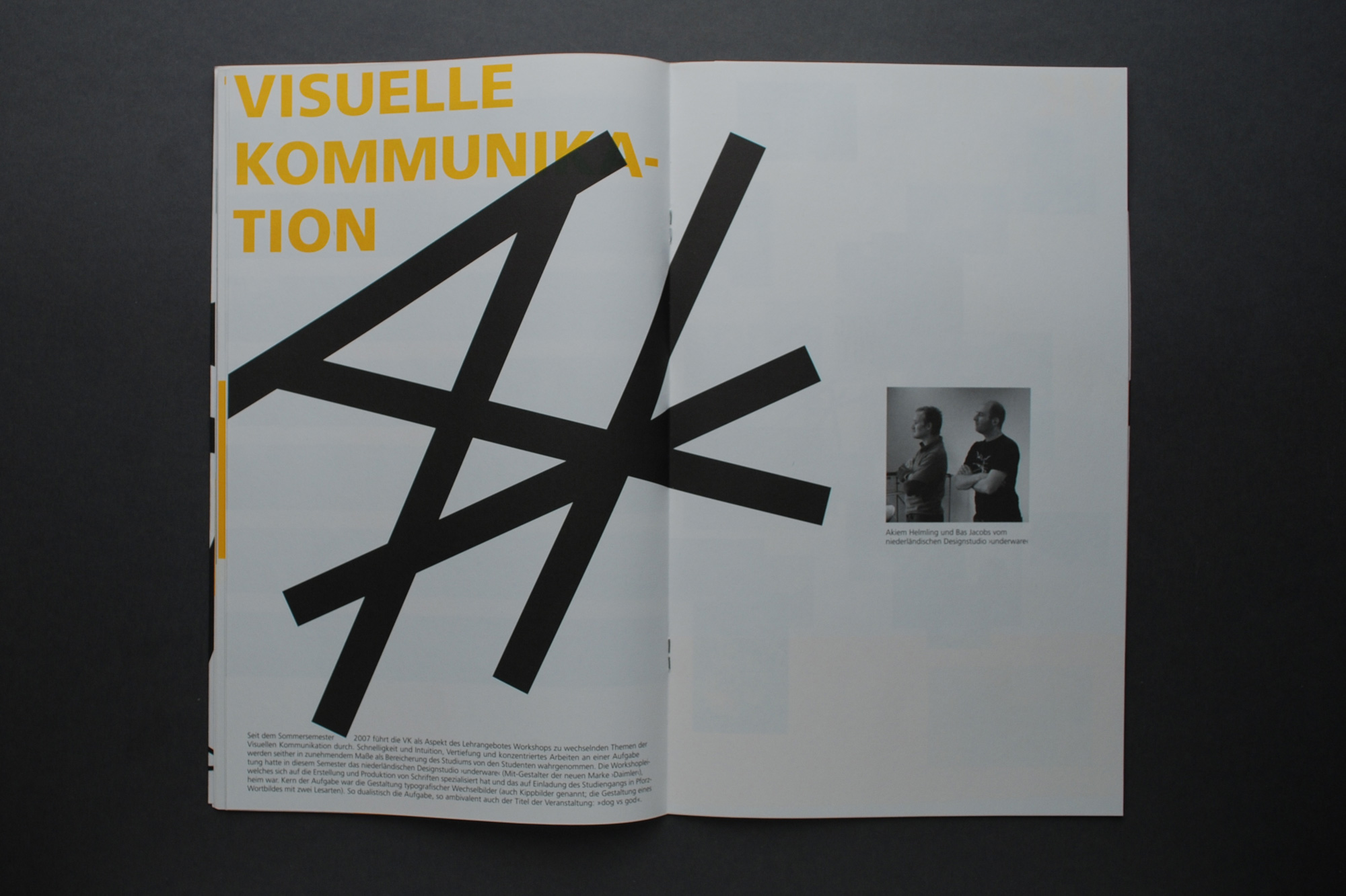
In addition to the logo system, I designed a printed magazine that showcased all design programs offered by the faculty. Each discipline was presented in its own visual language to reflect its unique character, using a cohesive layout system and editorial structure. The magazine functioned both as an informative overview and as a celebration of the faculty’s creative diversity.
RESULT
My design was selected as the official identity for the Faculty of Design at Pforzheim University. It became one of the institution’s first animated and modular branding systems developed by a student. The project anticipated trends in dynamic visual identities and demonstrated how branding, editorial design, and user centered thinking can work together in a consistent and expressive way.
The printed magazine received positive feedback during the Werkschau and helped position the faculty as a progressive and design driven environment. The project is still considered a benchmark for flexible design systems within the academic context.
To bring the new variable logo to life, I produced a set of temporary tattoos for the Werkschau. Students loved them and they quickly became a playful and memorable symbol of the refreshed identity.
