EAS Landschaftsarchitektur
Designing a refined identity for a modern landscape architecture studio.
About the Project
From naming consultation and brand positioning to a complete visual identity and digital experience, EAS was built to communicate architectural precision, calm confidence, and timeless quality across every touchpoint.
The Challenge
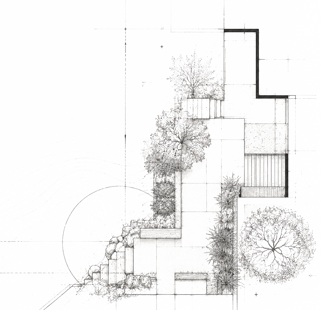
Landscape architecture shapes how people experience movement, atmosphere, nature, and space. Yet many studios within the industry present themselves through visually repetitive branding systems dominated by generic green palettes and interchangeable aesthetics.
EAS needed a visual identity that would immediately communicate professionalism, precision, and trust while still feeling calm, human, and emotionally refined. The challenge was not only to create a modern brand identity, but to build a complete visual system that reflects the balance between architecture and landscape, structure and nature, technical execution and emotional atmosphere.
At the same time, the identity needed to scale consistently across both physical and digital touchpoints while supporting future growth of the studio.
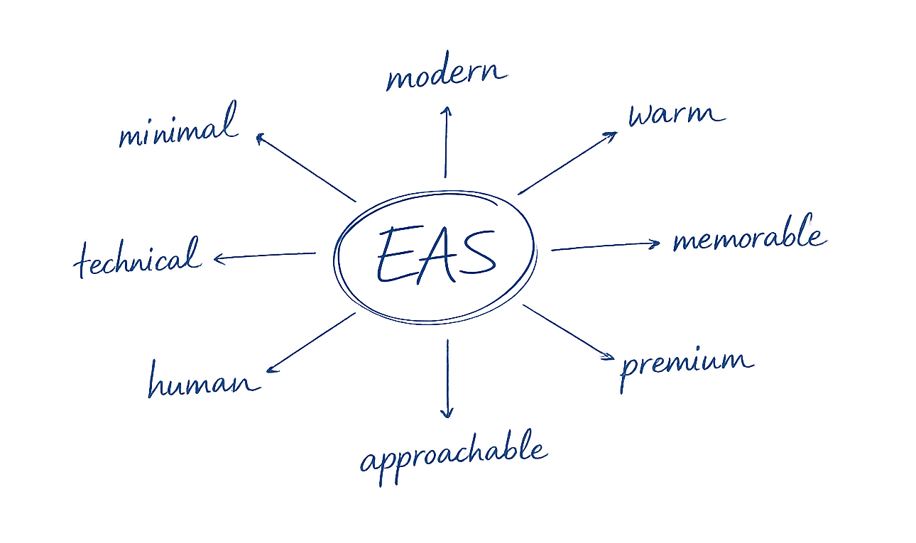
The identity was intentionally designed to feel:
Brand Prositioning & Research
Building a brand between landscape and architecture.
The project started with strategic consultation around positioning, naming direction, domain evaluation, and the overall perception of the future brand. Instead of following common landscaping aesthetics, the goal was to position EAS closer to the visual language of contemporary architecture and premium built environments.
This strategic foundation influenced every creative decision throughout the project.
Brand Positioning Matrix
Traditional ↔ Contemporary
Decorative ↔ Architectural
While many competitors position themselves around soft organic aesthetics, EAS was intentionally developed within a more architectural and structured visual territory. The result is a distinct identity that balances calm emotional presence with technical credibility and precision.
Material & Brand Concept
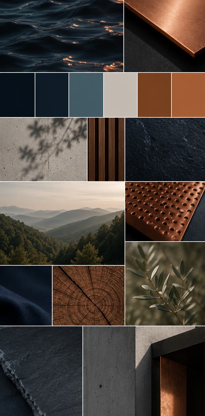
The visual direction was inspired by the relationship between natural landscapes and engineered environments.
- Copper became a defining brand element because it reflects the material world of construction, infrastructure, and architectural realization while simultaneously introducing warmth and tactility.
- Deep midnight blue creates a sense of calm authority and trust, while neutral material tones reference concrete, stone, wood, and outdoor surfaces.
The resulting visual language feels refined, architectural, and grounded in materiality rather than decoration.
Creative Vision & Visual Identity
Translating architectural thinking into a calm and timeless visual language. The creative direction focused on restraint, clarity, and atmosphere.
Instead of relying on visual complexity, the identity uses:
- generous whitespace
- elegant typography
- minimal compositions
- tactile material contrast
- refined color balance
Every element was designed to communicate confidence through precision. The visual system needed to feel timeless enough for long-term use while remaining distinctive within the category. The result is a brand identity that feels both contemporary and enduring.
Logo Creation
Designing a mark built on simplicity, balance, and precision.
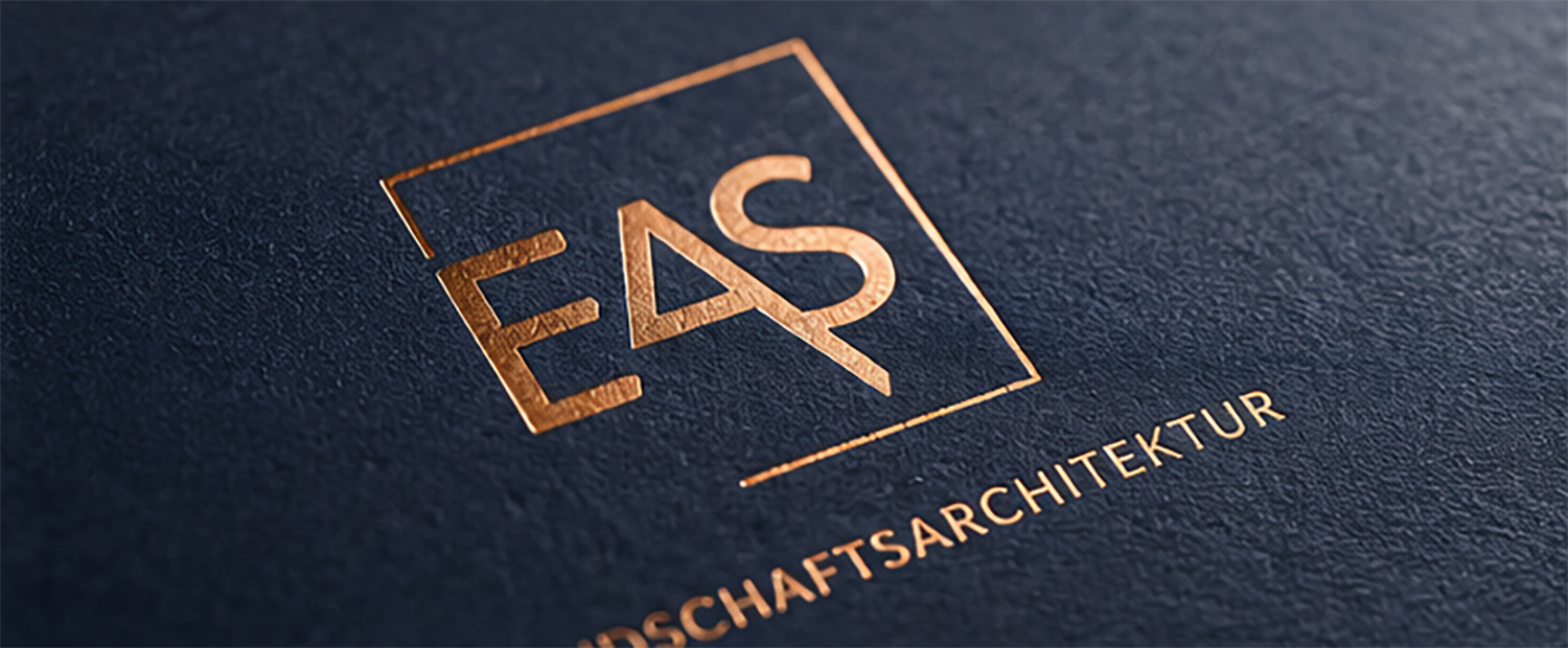
The logo was developed as a minimal and scalable identity mark inspired by architectural structure and spatial clarity.
Its geometric construction creates strong recognition while remaining understated and timeless. The identity avoids unnecessary complexity and instead focuses on proportion, balance, and long-term recognizability.
The restrained form language allows the logo to function consistently across:
- digital interfaces
- signage
- presentations
- physical brand applications
Color System
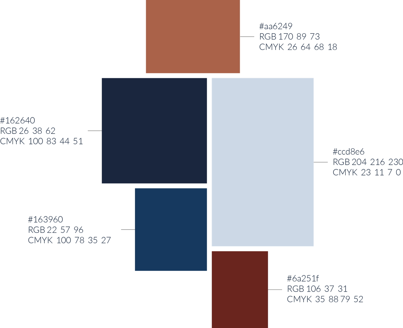
Deep Midnight Blue
Represents trust, structure, precision, and architectural calm.
Copper
Represents materiality, realization, craftsmanship, and engineered surfaces.
Soft Neutral Tones
Create balance, warmth, and spatial lightness across print and digital applications.
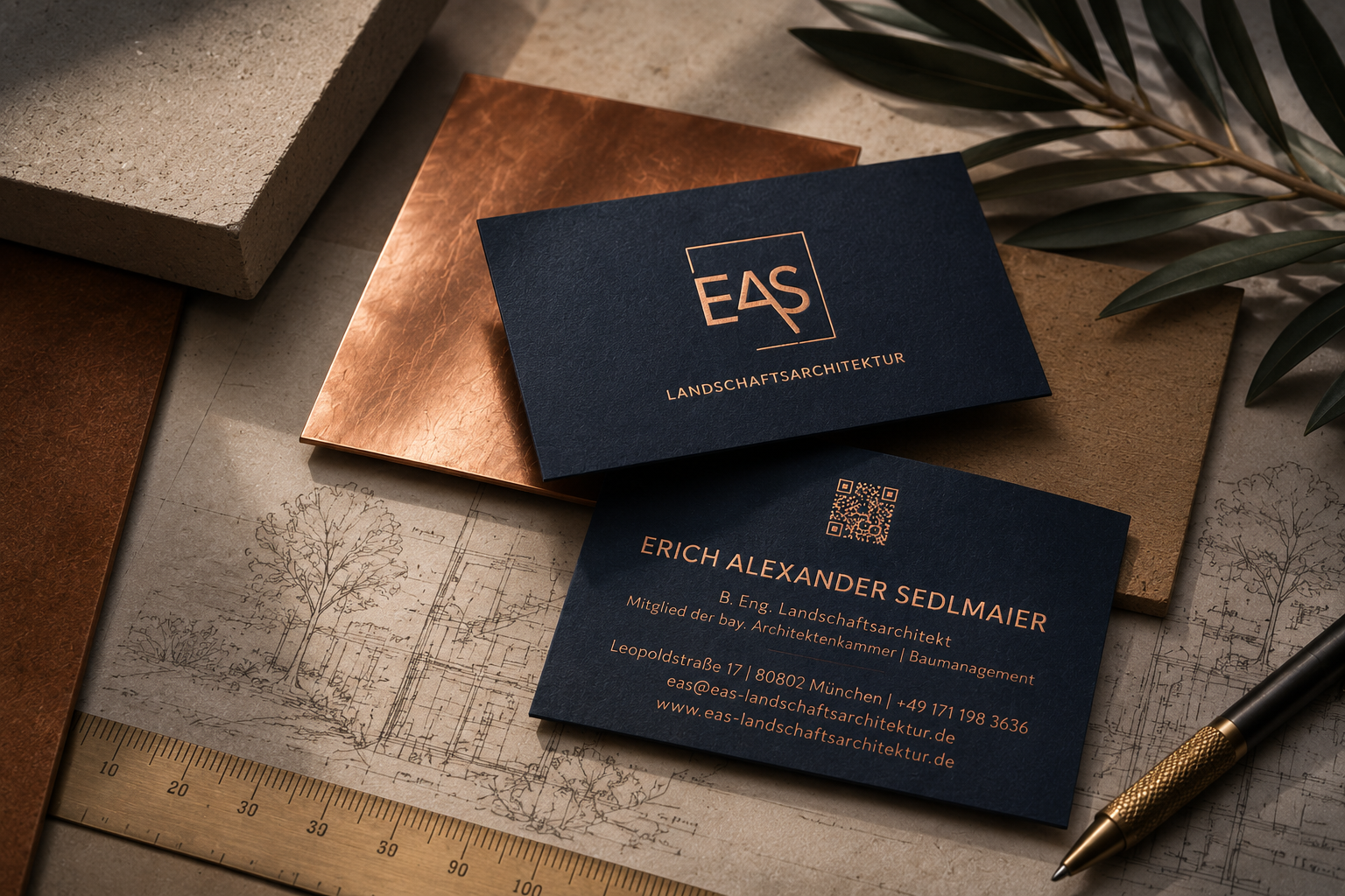
Designing brands that feel intentional, timeless, and deeply human.
EAS Landschaftsarchitektur combines architectural precision with emotional clarity across physical and digital experiences, creating a cohesive identity system built for long-term recognition and trust.